Case Study: Hopscotch Design System
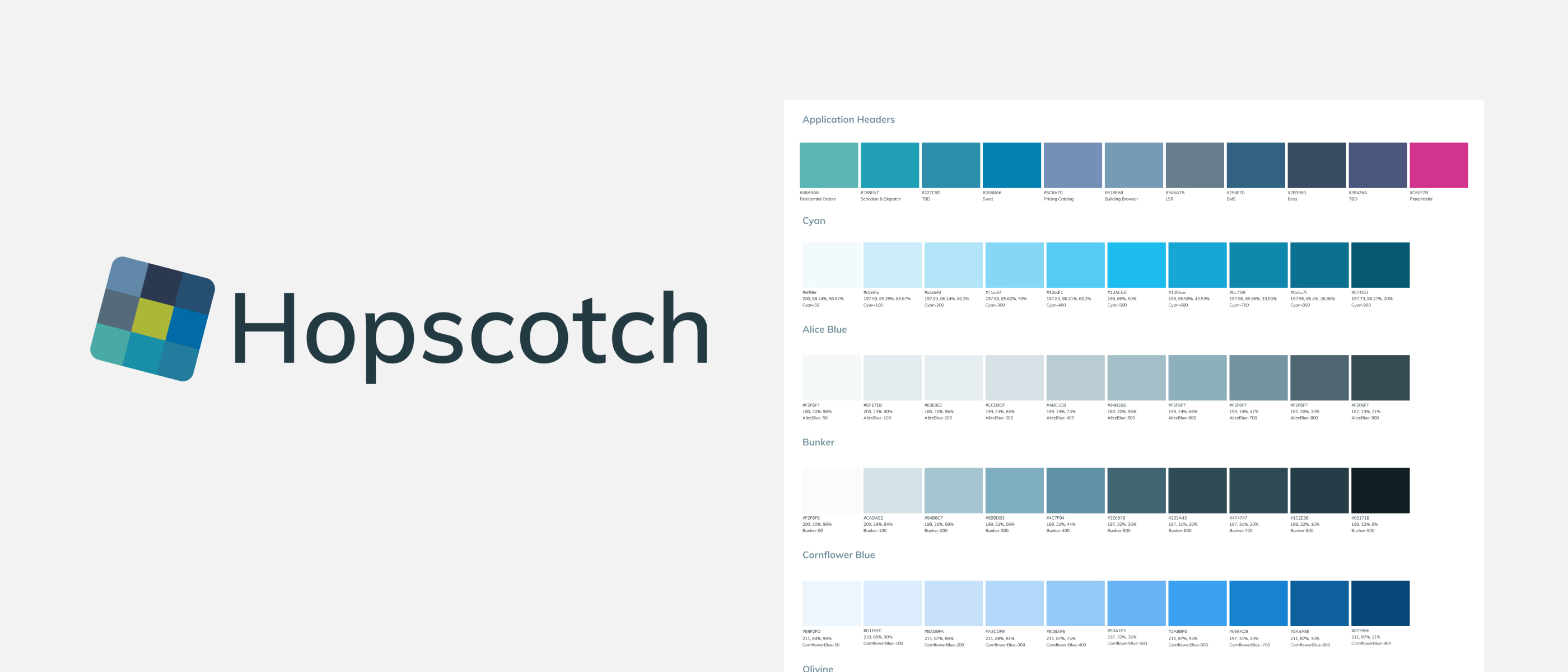
Hopscotch is a cutting-edge multi-theme design system built using the powerful combination of Atomic Design and Pattern Lab. This innovative design system provides a flexible and modular approach to design, allowing designers and developers to quickly create consistent and cohesive user interfaces across multiple platforms and devices.
Atomic Design principles are at the core of Hopscotch, meaning each design element is broken down into its smallest parts, or "atoms", and then grouped into larger, more complex components. This approach allows for greater flexibility and scalability in design, making it easier to create new themes and adapt existing ones to different contexts.
Pattern Lab is the framework that brings this system to life, allowing for rapid prototyping and testing of design patterns. With Hopscotch, designers and developers can quickly create and iterate on designs while ensuring consistency and cohesion across different themes.
In this case study, we will explore the key features and benefits of Hopscotch and how it has helped organizations streamline their design processes and improve user experience. We will also delve into the challenges and lessons learned during the development and implementation of this design system.
Problem Statement
Designing user interfaces across multiple platforms and devices can be challenging and time-consuming, often resulting in inconsistent and disjointed user experiences. Designers and developers need a flexible and modular approach to design that can accommodate various themes and contexts while maintaining consistency and coherence. Traditional design systems may need to handle the complexity of modern user interface design, leading to inefficiencies and a lack of scalability. In response to these challenges, the Hopscotch design system utilizes Atomic Design principles and Pattern Lab to create a multi-theme, flexible, and scalable design system that meets the needs of modern UI design.
Personas
The Hopscotch design system significantly impacts designers, developers, and end-users of the applications it serves. Here are some of the key ways the design system affects these stakeholders:
Designers
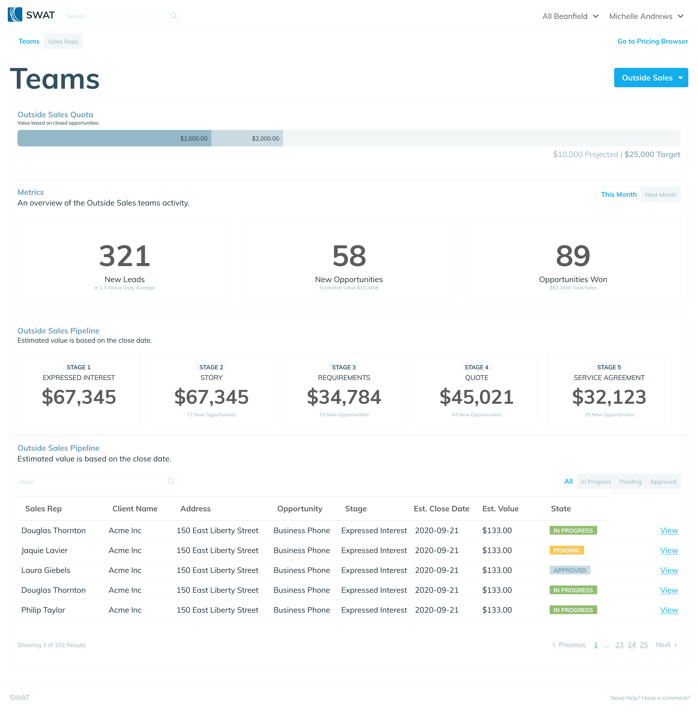
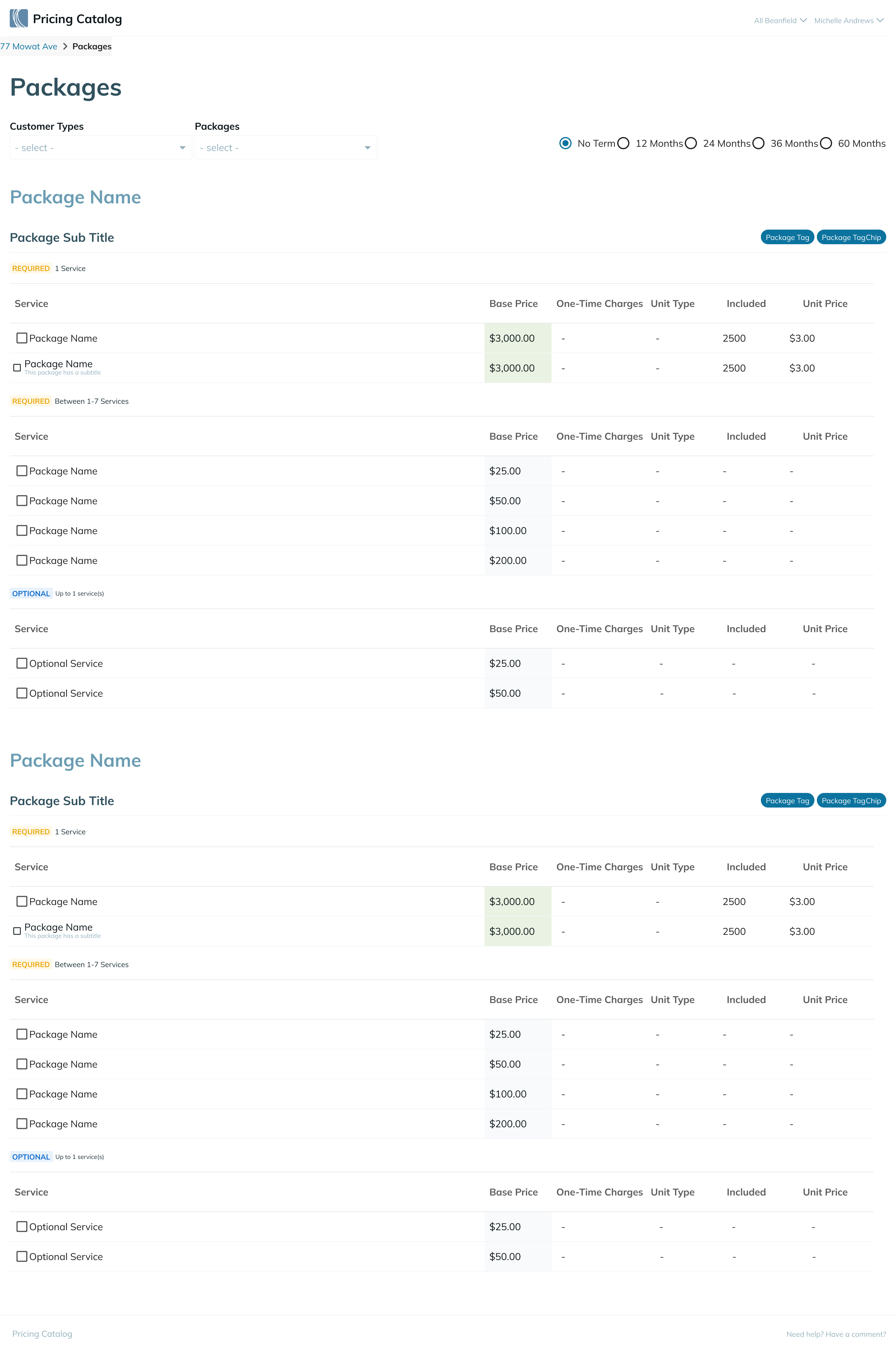
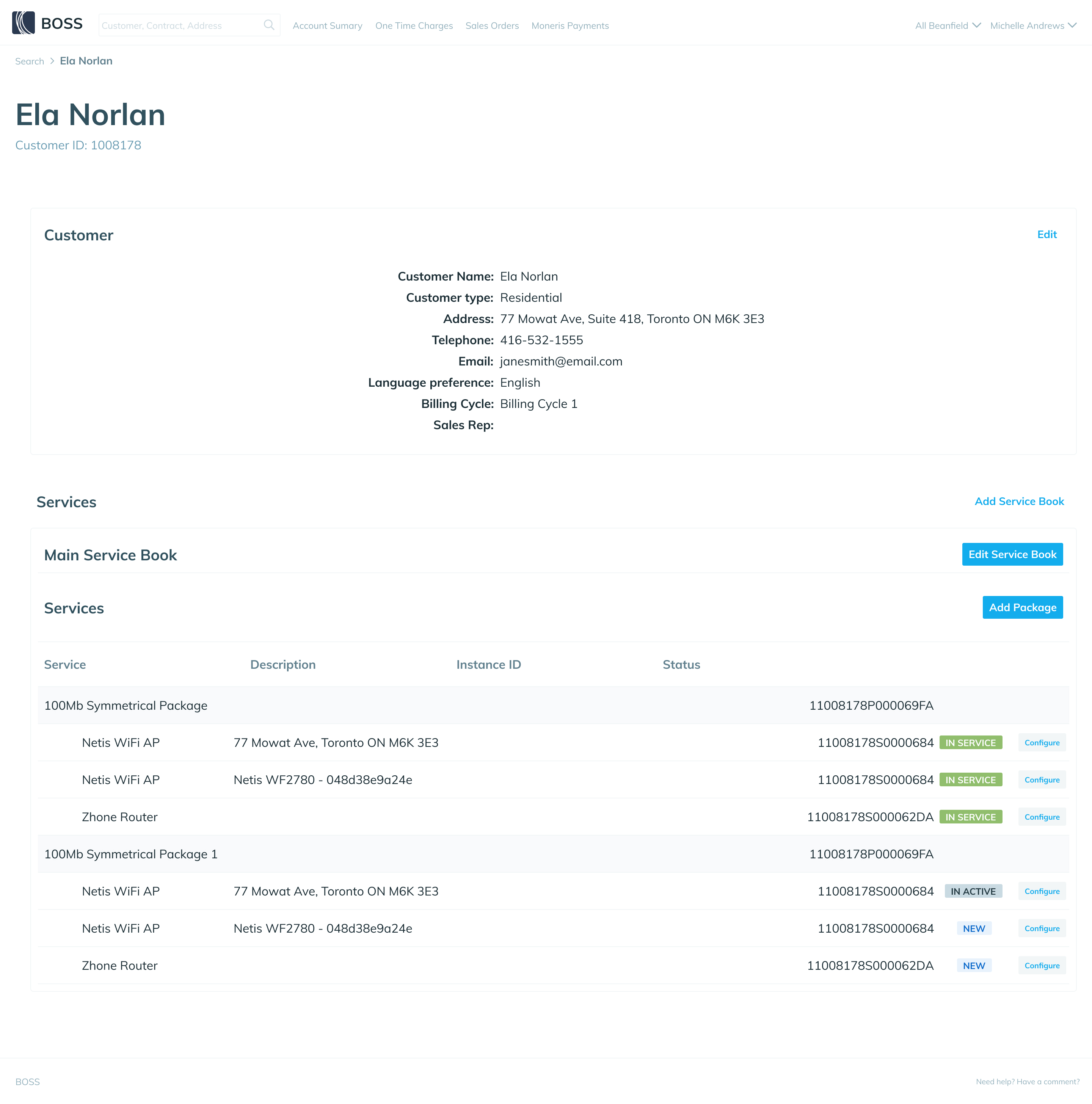
The Hopscotch design system provides a set of pre-built components and design patterns that can be used across multiple projects. Using a UI kit saves designers time and reduces the need to create new design elements from scratch, allowing them to focus on more strategic and creative design tasks. The system also ensures consistency and cohesiveness in design, making it easier for designers to maintain a unified visual language across different projects.
Developers
The Hopscotch design system provides a library of pre-built components and design patterns that can be easily integrated into projects. The system also provides clear documentation and guidelines, making it easier for developers to understand and use the design components effectively. Saving developers time and effort in coding and debugging new design elements, allowing them to focus on other development tasks.
End-users
The Hopscotch design system creates a consistent and intuitive user experience across multiple applications and platforms, improving the usability and accessibility of the applications and making it easier for end-users to navigate and interact with the interface. The system also helps ensure the design is responsive and adaptable to different devices, ensuring a seamless user experience across all platforms.
Overall, the Hopscotch design system positively impacts all stakeholders involved in the design and development process, from designers to developers to end-users. It saves time and effort, improves consistency and cohesiveness in design, and creates a better user experience.
Process
It started with the design audit to identify areas that could be improved or streamlined. It focused on typography, colour palettes, layout, and redundancies in design elements or components. We documented design assets, including style guides, templates, and design files.
Once the audit was complete, designers and developers began to identify the fundamental atoms that make up the design. Once the atoms have been identified, they were combined into molecules, which are small, reusable components that can be used in multiple contexts.
From there, the molecules were combined into organisms, which are larger, more complex components, such as navigation menus or forms.
Finally, the organisms were combined into patterns, fully-realized design solutions for specific contexts, such as a dashboard, repository or report.
By conducting a thorough design audit and building an atomic design system, designers and developers could quickly build cohesive, scalable, and flexible designs that could be used across multiple platforms and devices.
Outcome
The Hopscotch design system has proven to be highly effective in improving the efficiency and consistency of user interface design. By utilizing Atomic Design principles and Pattern Lab, Hopscotch has enabled designers and developers to rapidly create and iterate on designs while ensuring consistency and coherence across different themes and contexts.
After implementing Hopscotch, teams reported significant improvements in design productivity and reduced design inconsistencies. Hopscotch has also helped teams to streamline their design processes and improve the overall quality of user experience.
Additionally, the modular and scalable nature of Hopscotch has allowed for easy customization and adaptation to different platforms and devices, providing organizations with a flexible and adaptable design system that can evolve.
Overall, the outcomes and results of Hopscotch have been highly positive, demonstrating the value of utilizing Atomic Design principles and Pattern Lab in modern user interface design.