Multi-Platform Design System
Building shared foundations across 25 acquired products. Six brand lines, multiple platforms, one system that had to work for all of them
System overview
Executive Summary
High-level context and outcomes
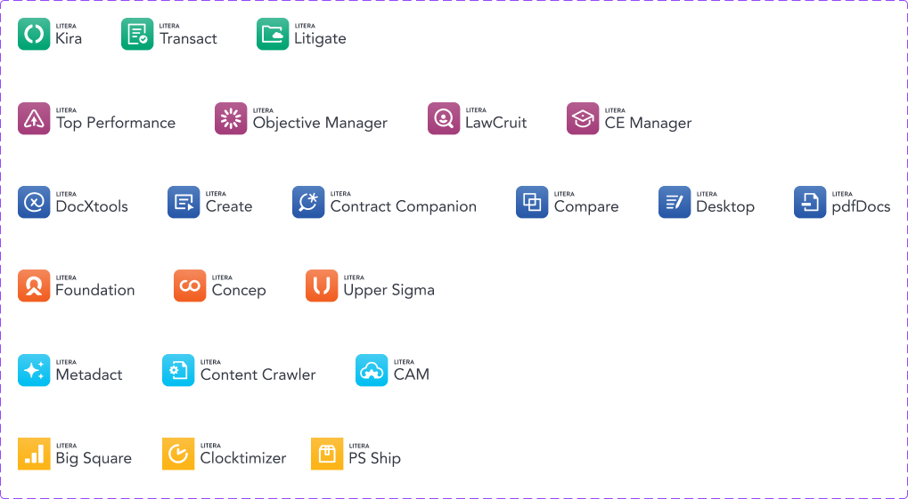
Litera had grown through acquisition. The result was 25 products with different tech stacks, different branding, different visual languages, and no shared foundation. Multiple Word add-ins that were separate builds. Legacy desktop and on-prem applications that needed to move to the cloud. Six vertical lines of the business, each with its own identity.
I led the design system work that made consolidation possible. Not a single unified UI. The landscape was too varied for that. Instead, a layered token architecture that could support full component adoption for some products and CSS reskins for others, all from the same foundation.
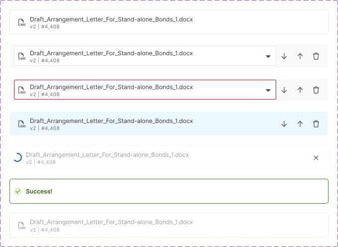
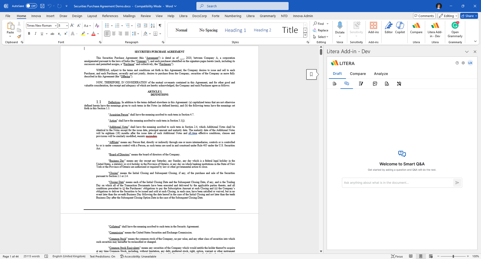
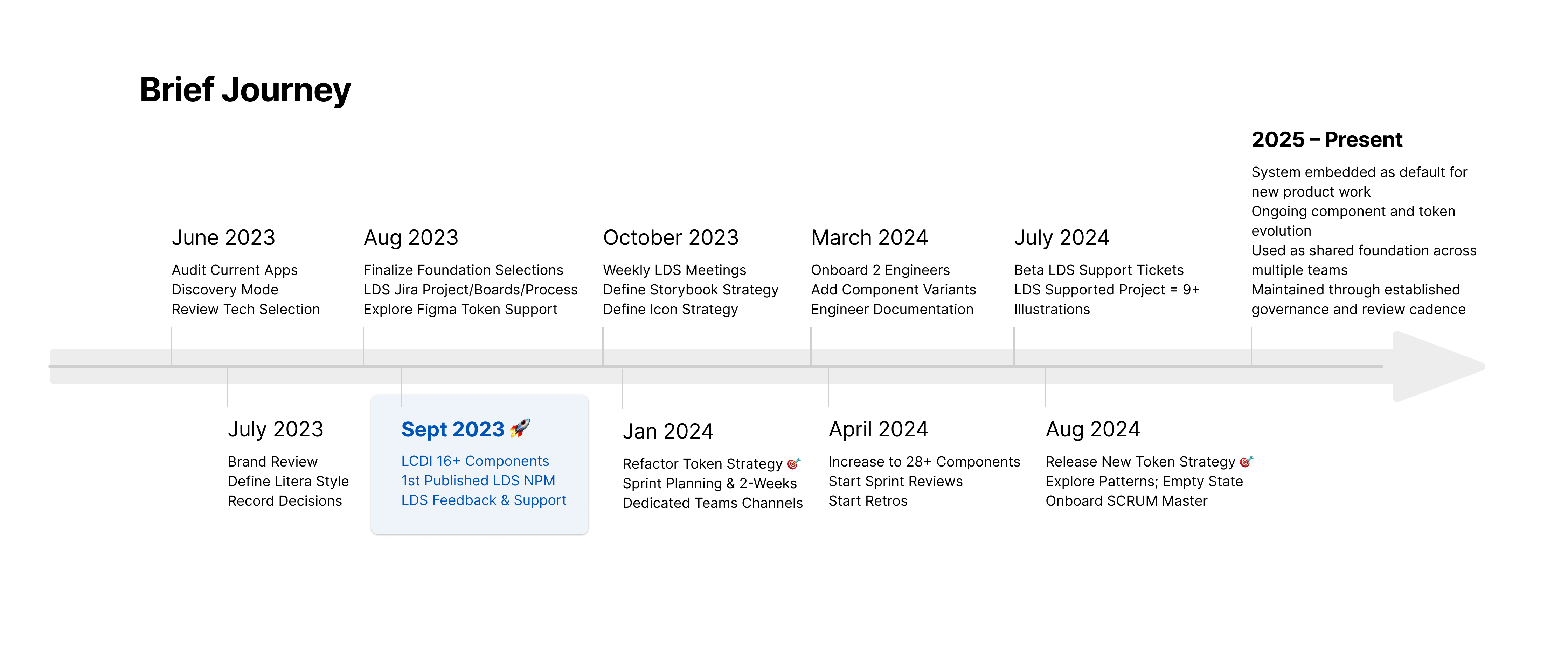
We launched the first consolidated Word add-in within 6 months. The rest followed. Two years later I led the migration to Fluent UI across web, Word, and Outlook.
The goal wasn't visual uniformity. It was giving teams a foundation they could actually rely on. Getting to simplicity turned out to be the hardest part.
Org-level impact
| Dimension | Before: Fragmented foundations | After: Shared system |
|---|---|---|
| Products | 25 acquired products, separate builds | Consolidated suite, first shipped in 6 months |
| Brand lines | 6 separate identities, no shared token layer | Single token architecture, brand swapped via 5 core colours |
| UI decisions | Re-litigated per product and team | Defined once, reused everywhere |
| Token structure | Inconsistent or locally defined | Layered architecture: core, semantic, component |
| Adoption path | No shared path. Each team solved it alone | Full components or CSS reskin, both supported |
| Delivery impact | Custom builds and rework | Faster delivery with fewer overrides |
The Problem
What we walked into
When Litera acquired 25 products, the design and engineering landscape was fragmented in every dimension that matters. Different tech stacks. Different branding. Different visual languages. Multiple Word add-ins that were separate builds. Legacy desktop and on-prem applications that needed to move to the cloud.
Teams were in separate boats going the same direction. The work wasn't coordinated. It was parallel, overlapping, and expensive. Engineers absorbed the cost through custom fixes. Designers re-litigated the same patterns on every project. Product teams lost speed to alignment overhead that shouldn't have existed.
We were learning how to row a boat rather than being in separate boats going the same way.
The problem wasn't just visual inconsistency. It was organizational cost: time, rework, and decisions that should have been made once but kept getting made again.
Fragmentation snapshot
Constraints and Success Criteria
Real-world limits that shaped the approach
The system had to work across a landscape that wasn't going to simplify itself. Some products could adopt components directly. Others, particularly the legacy reskins, could only consume CSS. Both paths needed to come from the same foundation, or we'd just be recreating the fragmentation we were trying to fix.
Practical constraints:
- Multiple platforms: web, Word add-ins, Outlook, legacy desktop
- Six brand lines, each with its own visual identity
- Products in market with active roadmaps, no big-bang migration
- Teams with varying design and engineering maturity
- No centralized mandate to enforce adoption without risking delivery
We defined success in operational terms:
- First consolidated Word add-in shipped within 6 months
- Brand theming achievable by swapping 5 core colours, nothing else
- Fewer bespoke UI decisions during feature development
- Faster alignment between design and engineering
- A single source of truth for styles, managed by design, visible to everyone
I didn't enforce adoption upfront. Letting teams move forward while gradually introducing shared foundations kept projects moving and built trust in the system.
Foundations and tokens
Strategy and Key Decisions
How shared foundations and governance were established
Basics first, not components
Instead of starting with a component library, I began with shared basics: design tokens, spacing, typography, color, interaction rules.
Without shared basics, components just recreate the same problems at a higher layer. Teams end up with components that look consistent but behave differently underneath. That is almost worse than having no system at all.
Starting with tokens let product and engineering teams agree on foundational decisions while letting each platform adapt where needed. It lowered long-term maintenance costs and gave engineers building blocks they could trust before we'd built a single component.
Guidelines and foundations
Building the token architecture, solo, from scratch
The token set needed to support six brand lines, multiple platforms, and two adoption paths simultaneously. I started with MUI, transformed it using variables, and initially exported JSON. Then I learned Token Studio and built a multi-brand token architecture using the CTI syntax with Style Dictionary.
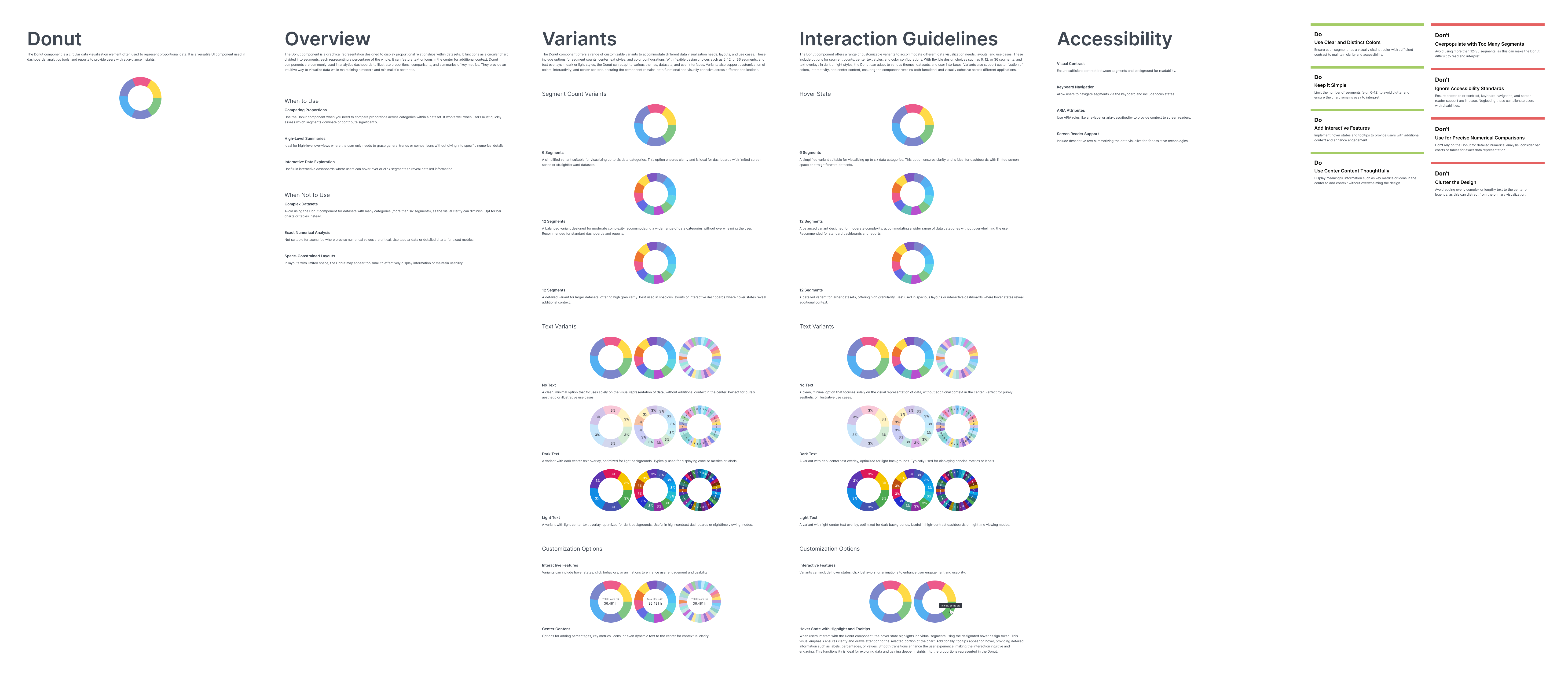
The structure was a layer cake: core tokens at the foundation, a semantic layer above that for designers building new things, and component tokens at the top that ingested the semantic layer. Data visualization tokens: 36 colours across default, light, and dark mode. Illustration tokens that swapped with the brand. All of it designed to output correctly through Style Dictionary.
I did this work myself. The iteration loop between me and an engineer would have been too slow. So I learned the tooling, ran the tests, found where the structure broke, rebuilt it, and kept going until it held.
Getting to simplicity was hard. The token set looks clean when you use it. It took months of iteration, a lot of research, a lot of wrong turns, to get there.
The hardest part was removing deep specific classes and keeping the naming generic enough to scale and clear enough that anyone onboarding could understand the hierarchy without needing to read a manual. When designers started using the system and stopped reaching for the wrong variant, I knew the naming was working. The previous MUI tokens failed because the hierarchy was opaque. These worked because the structure matched how designers think.
I also learned something practical about this kind of work: any time away broke my focus and thinking. I had to carve out dedicated blocks of time, protected from the normal pull of daily delivery, to make real progress. That was the only way to hold the full structure in my head long enough to get it right.
Six different brands driven by swapping 5 colours. That's what the architecture had to support. Getting there required learning from people who'd written about token systems: articles, documentation, community knowledge. Nothing would be an exact match for the specific problem I was solving.
Governance through clarity, not enforcement
Instead of strict rules, I set up simple guidelines with clear defaults, explained tradeoffs, gave real examples. Made these decisions with design, product, and engineering leads so they matched real delivery needs.
Teams didn't need permission or extra meetings. The system answered most questions before they became problems.
But governance requires more than good documentation. I was one designer. When I saw problems, designers using the wrong variant, drifting from the system, I could educate but I couldn't enforce. We were moving fast and without organizational backing, a single voice can only do so much.
That changed when we moved to Fluent. Management supported structured design reviews for the first time. That backing made the difference. Not because the system changed, but because the conditions for using it properly finally existed.
Reusable patterns
Design system as shared language
The system was designed to be a common language, not just for designers, but for product and engineering too.
Engineers could understand tokens, behavior, and limits without always needing design help. Product partners could plan better knowing scope and tradeoffs early. Designers could count on consistent patterns across products.
Teams could work in parallel with fewer last-minute surprises. The system answered questions before they were asked. That is the point.
Explorations
Outcomes and Impact
Observable changes in how teams worked and shipped
The first consolidated Word add-in shipped within 6 months. The remaining products followed on the same foundation. Two years later, the system supported a full migration to Fluent UI across web, Word, and Outlook. Three platforms with different component models and release cadences, without requiring teams to rebuild from scratch.
In practice:
- Six brand lines supported from a single token architecture, brand swapped by changing 5 core colours
- Reduced rework caused by inconsistent foundations across products
- Faster alignment between design and engineering during planning and delivery
- Design reviews shifted from foundational UI debates to product quality decisions
- Fluent migration supported incrementally. Teams migrated without blocking delivery
The work shifted conversations from how things looked to delivering the right solutions on time.
Impact proof
What I Learned
Lessons from designing systems at organizational scale
The hardest part of this work wasn't technical. It was knowing when to go deep and protect that focus. Token architecture at this scale requires holding a lot of structure in your head simultaneously. Every interruption has a cost. I learned to carve out dedicated time and defend it, because that's the only way complex systems thinking actually gets done.
I also learned that a design system without organizational backing is always fighting uphill. I could build the right structure, write the right documentation, educate wherever I could. But one voice can only carry so far. Governance requires authority, not just expertise. When management finally supported design reviews during the Fluent migration, the system started working the way it was designed to. The lesson: advocate early for the conditions that make the system usable, not just the system itself.
And the thing I keep coming back to: getting to simplicity is hard. The token set looks obvious in hindsight. Swap 5 colours, everything updates. But it took months of iteration, wrong turns, and rebuilding to get there. Simple systems are earned, not designed.
Simple systems are earned, not designed.