AI Assistant for Document-Heavy Legal Work
Designing an AI workflow that reduces review risk and scales legal analysis
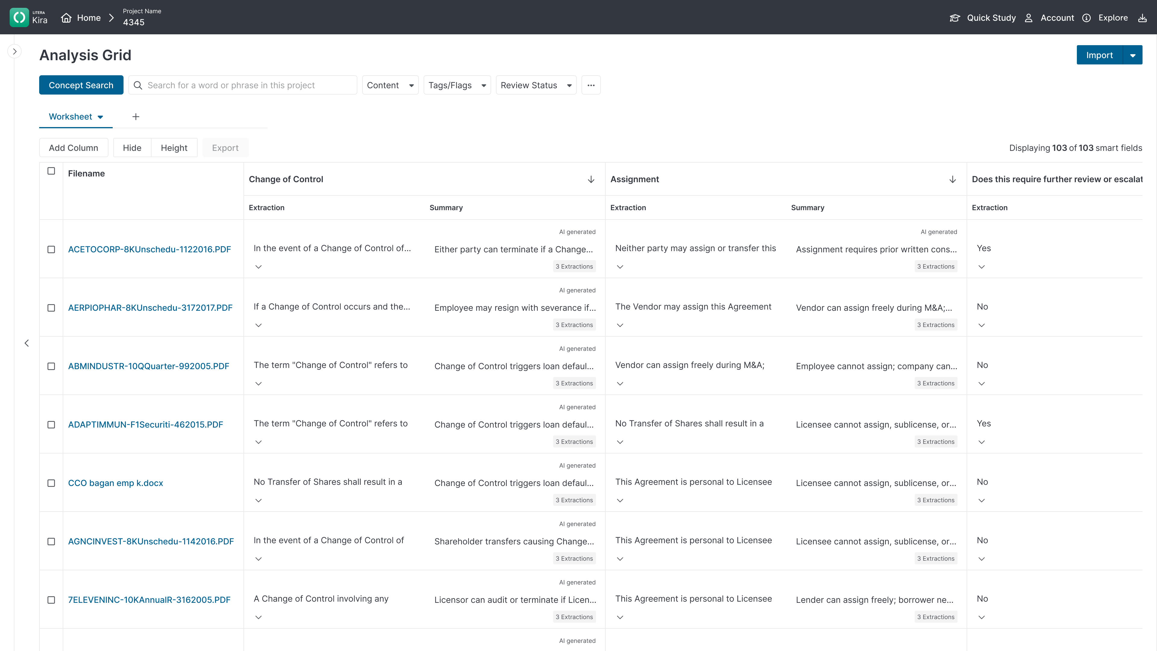
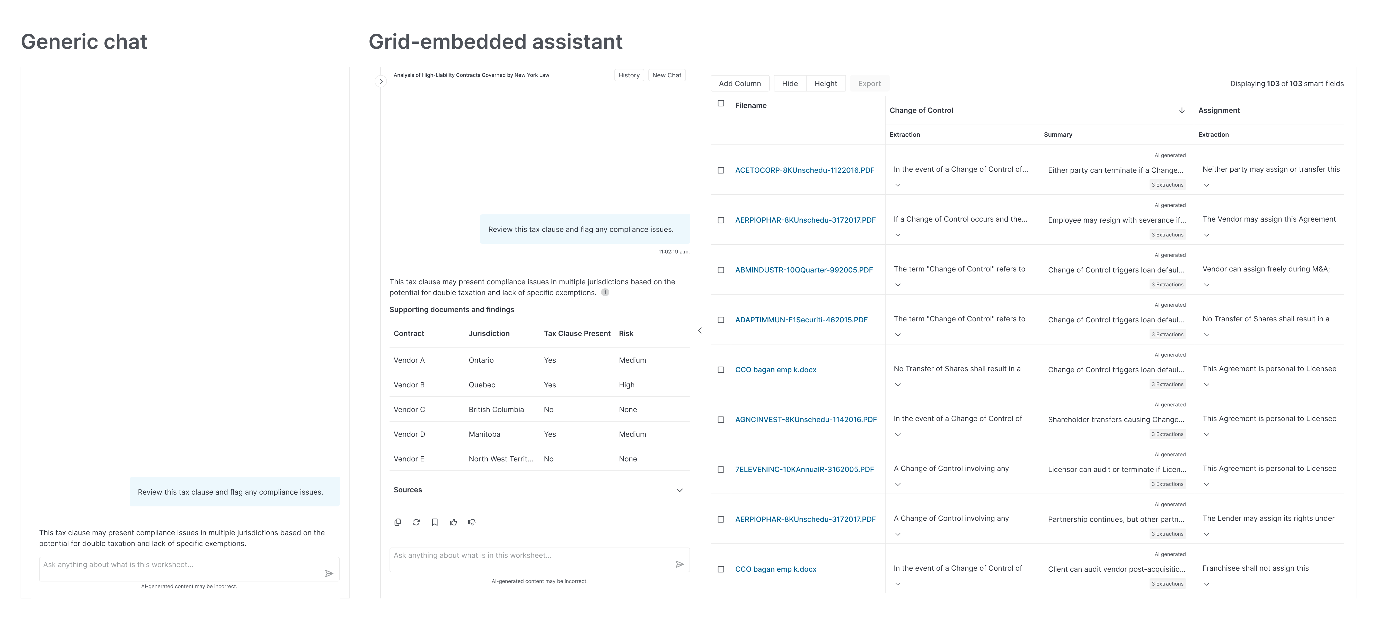
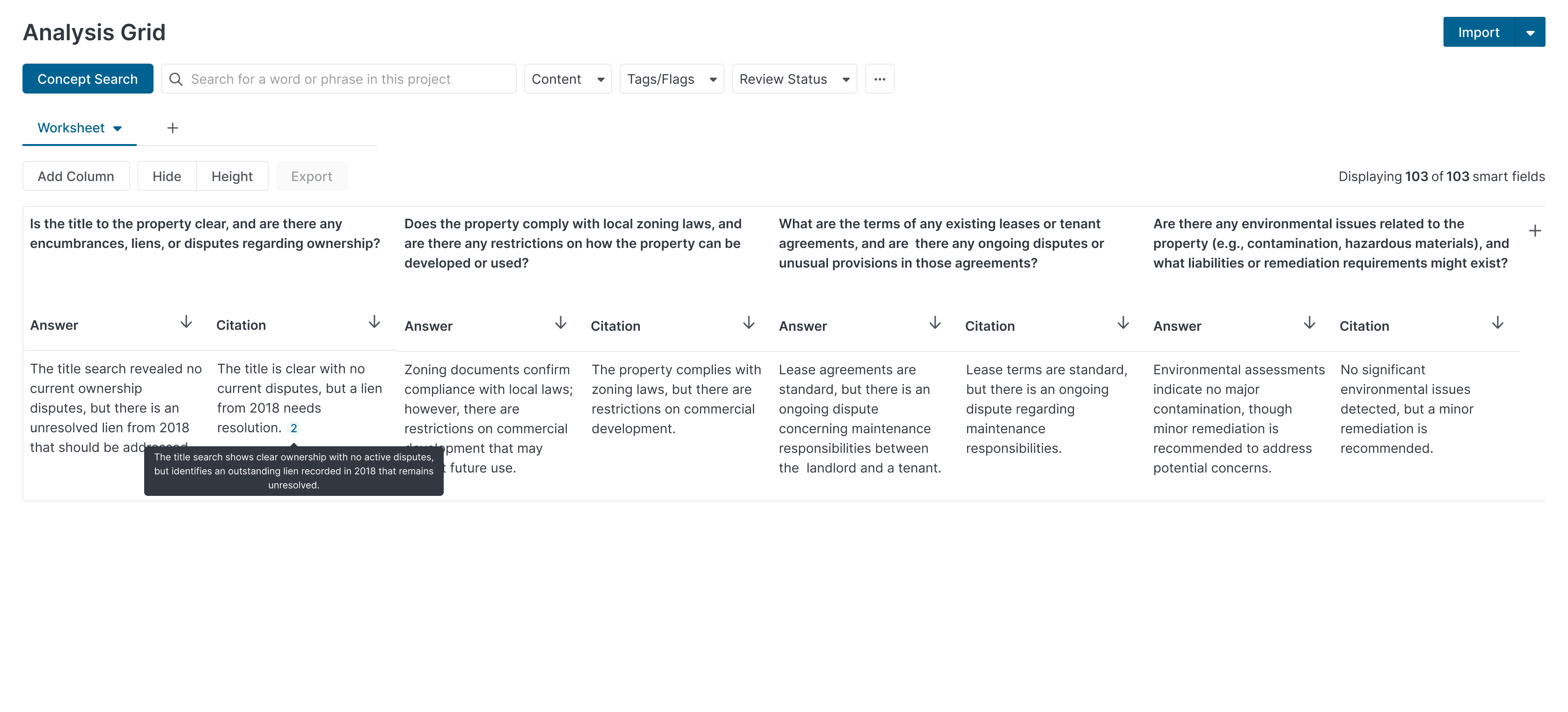
The original interface was an analysis chart. Documents down the left, legal clauses along the top, and a number in each cell. To see anything meaningful you had to hover for a tooltip. If a document had multiple extractions you had to click in, losing sight of where you were in the full set.
It gave lawyers an overview of what was there. But a number tells you something exists, not what it means. The substance was always one more click away, and every click pulled you further from the full picture.
The grid changed that. Everything visible at once. Drill down into any answer without breaking focus. The source document is always within reach when a finding needs to be verified, but the review stays continuous. The AI layer was built on top of that foundation, not the other way around.
Role & Context
Role
The concept started as an idea tested at LegalWeek by stakeholders. It had market signal but no defined shape. From there a brief was created and the real work began. I worked end to end on the design, from early discovery through to build, alongside a data scientist, a product manager, and Legal Knowledge Engineers, all former lawyers. The brief gave us a starting point. The people in the room gave us the constraints that made it real.
Context
Enterprise legal teams review hundreds or thousands of documents per matter. AI promised faster work, but early tools didn't earn trust. Unclear answers, no clear boundaries, hard to defend findings. I led the design end to end, from research through to build. An early prototype was showcased at LegalWeek to validate the concept before further discovery and iteration.
Business Problem
The pressure to ship AI features was real. Every product in the space was adding them. The question wasn't whether to use AI, it was whether to use it with purpose or just use it.
The brief was clear on this. AI needed to earn its place in the workflow, not be dropped on top of it. A chatbot that answered questions without context, without citations, without any connection to the documents under review, would have been faster to build and worse for lawyers. It would have created the appearance of intelligence without the substance.
The goal was a meaningful experience. Something that fit how legal review actually works and made lawyers better at it, not just faster.
What Success Looked Like
Success wasn't just moving faster. It was moving faster without breaking focus.
Legal review requires sustained concentration. Every time a lawyer had to switch context to verify an answer, cross-reference a source, or second-guess an output, the work slowed down in ways that didn't show up in time estimates but showed up in errors and fatigue.
The measure of success was a lawyer who could stay in the grid. Who could follow a finding from the AI output to the source extraction without losing their place. Who could trust what they were seeing because the evidence was always visible, always grounded in the document, never just an answer floating without support.
Reducing ambiguity didn't mean hiding uncertainty. It meant making the AI's reasoning transparent enough that a lawyer could decide whether to trust it, push back on it, or override it. That's what made it reliable.
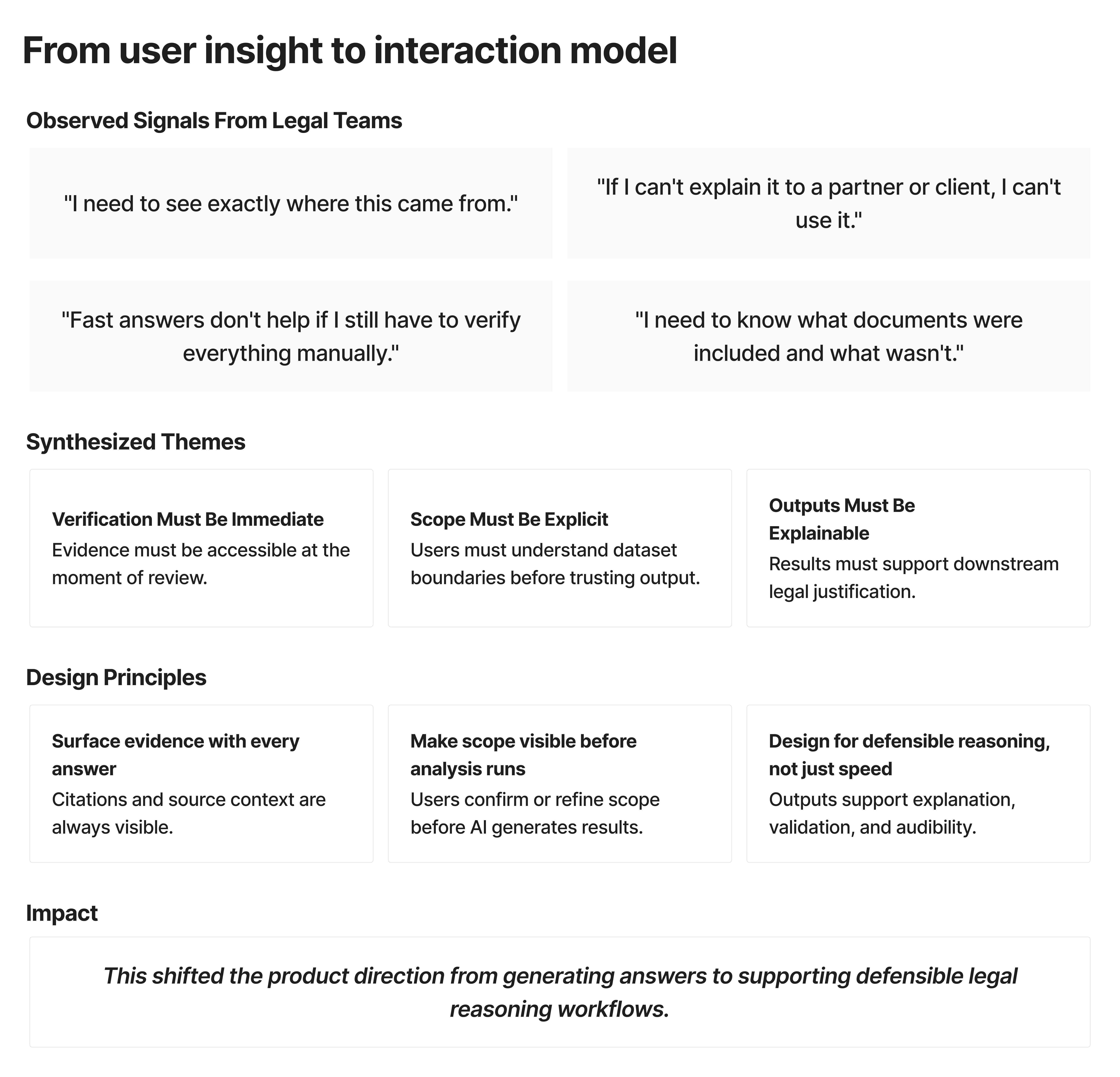
Key Insight from Discovery
Lawyers aren't looking to hand their work to AI. They still have to do the work. Every answer still has to be verified, every finding still has to be defensible. What they needed was a way to get to the evidence faster.
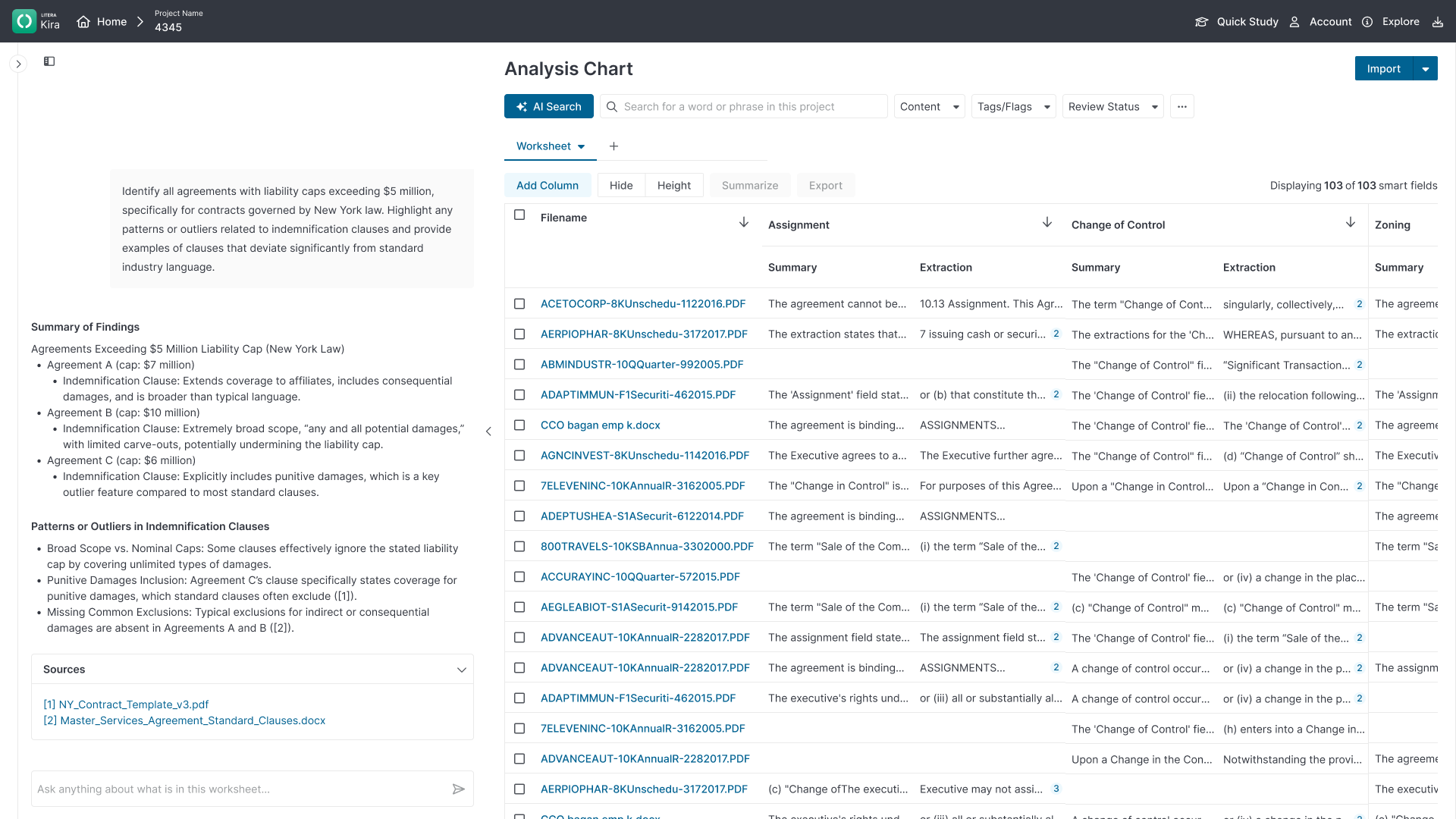
The original interface made them dig for it. The grid surfaces it. Instead of hunting through tooltips and clicking into extractions one at a time, everything is visible in context. The chat lets them interrogate quickly when they have a specific question. The grid shows them what the AI found. The panel lets them read the extraction, add a summary, and move to the source document when they need to confirm it.
The AI doesn't replace the lawyer's judgment. It clears the path so that judgment can be applied where it matters.
Design Strategy and Decisions
The grid and the chat were never two separate features in my thinking. They were one system. I had to see how they worked together, test them together, before anything could ship. The team divided the work to deliver it in phases. My job was to make sure the seams didn't show.
That meant every grid interaction was designed with the chat layer already in mind. The scope controls, the citation surfaces, the way a finding moves from a cell to a panel to a source document. All of it had to hold up across both modes before either went into production. Shipping in phases is a reality of product work. The risk is that phase one gets optimised in isolation and phase two becomes a retrofit. I designed to prevent that.
Slowing down to go faster
The team was cautious about touching the AI. There was resistance to adding friction to something that was supposed to feel fast. What shifted the conversation wasn't a design argument, it was outside pressure. Other teams were already working with AI and the company needed a consistent voice and tone across products. That gave us the opening to establish some principles.
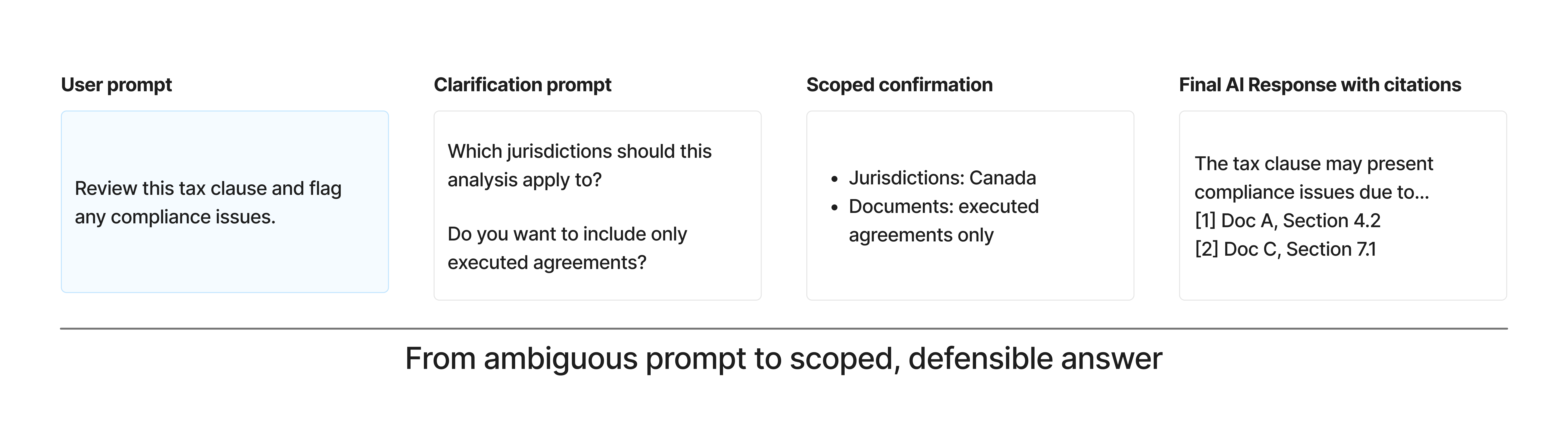
The core problem with AI in this context is overconfidence. It has a tendency to answer at length and with certainty regardless of whether the question was clear enough to warrant it. I wanted to change that. If the question was straightforward, the AI should respond immediately. If the question was vague, it should ask for clarification before generating an answer. The balance matters. Too much gatekeeping creates its own friction and erodes trust in a different way.
The clarification loop wasn't about slowing things down. It was about making sure that when the AI answered, it was answering the right thing.
The clarification loop wasn't about slowing things down. It was about making sure that when the AI answered, it was answering the right thing.
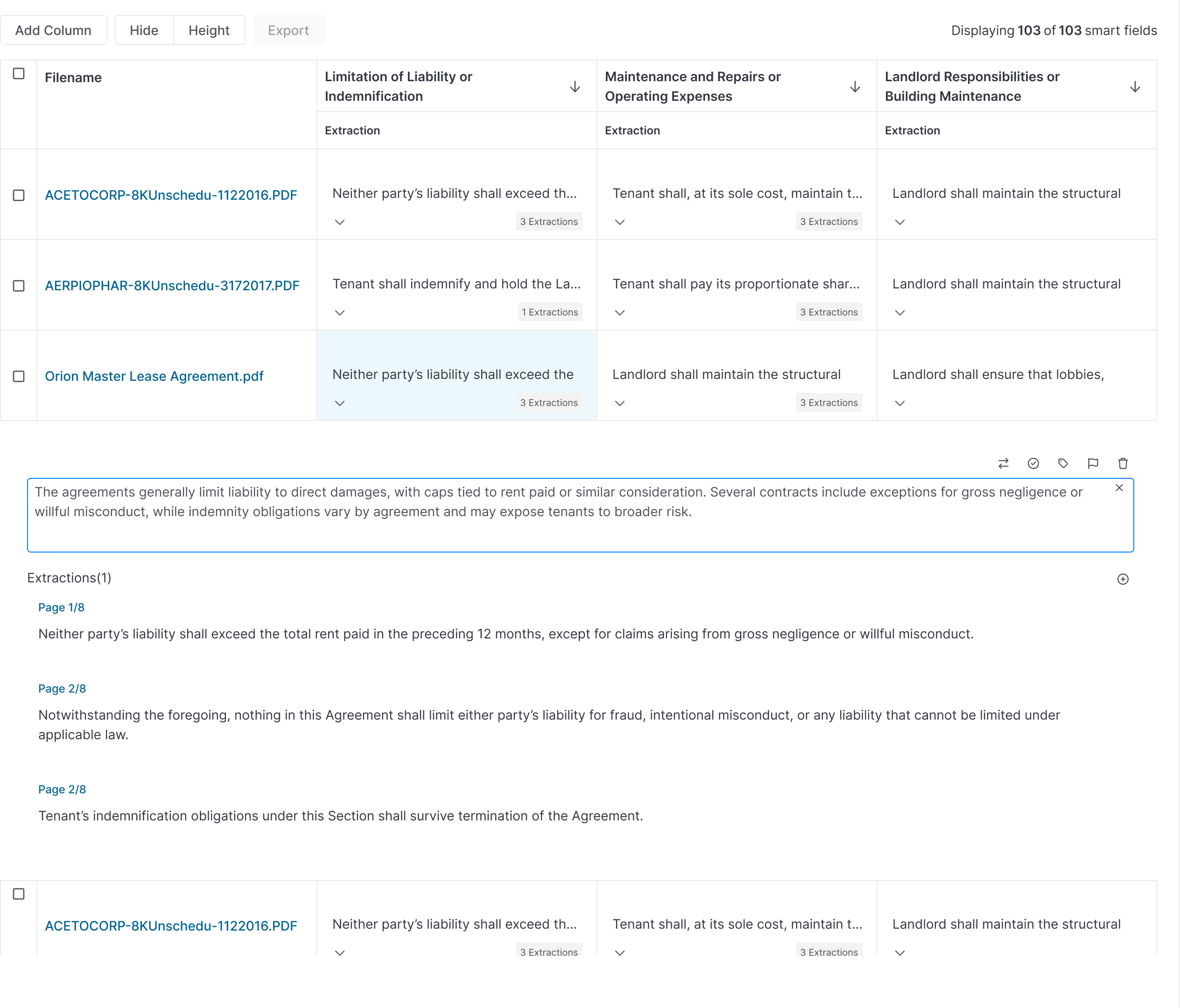
Keeping the evidence visible
AI summaries sit directly inside the document grid rather than in a separate panel or chat thread. From the grid, lawyers move from a high-level answer to the cited excerpt in the source document without losing context of where they are in the full review. Scope stays visible. Evidence stays linked. Findings stay defensible.
Pushing back on pagination
At scale, some matters run to tens of thousands of documents. Pagination was the engineering default. Safe, predictable, well within Mantine's out-of-the-box behaviour. I pushed back. Lawyers aren't browsing. They're hunting for risk. If a filter narrows the results and the most critical finding is on page five, there's a real chance it gets missed. Pagination imposes a hierarchy that doesn't match how legal review actually works.
Continuous scroll keeps the full result set in view, supports faster comparison, and maintains the birds-eye perspective lawyers need to assess risk across a document set. What resolved it wasn't just a design argument. I worked closely with the Legal Knowledge Engineer on the team, a former lawyer, who validated that this matched how legal review actually works. That input carried weight with the PM in a way that a design rationale alone wouldn't have.
I've learned that a single design voice often isn't enough. Finding the right ally, someone whose perspective the room will actually hear, is part of the work.
Trust as a design problem
Trust wasn't a byproduct of getting the UI right. It was a design problem in its own right.
The grid is what solved it. By grounding every AI output in the source document, the AI couldn't go rogue. Citations weren't a feature added for reassurance, they were structural. An answer without a source couldn't exist in this system because the grid didn't allow it. The evidence was always visible, always tied to something real.
That constraint shaped every decision. No free-form answers without citations. No automated conclusions without human review. No confidence scores without evidence context. Not because we didn't trust the AI, but because the lawyers needed to.
Validation & Outcomes
I ran internal testing to validate the core workflows. The feedback confirmed the approach: structured review with visible evidence and human control at every stage matched how legal teams actually worked. The shared principles that came out of the work, around trustworthy AI in legal contexts, carried forward into subsequent product decisions.
Reflection
If I did this again, I'd test clarification patterns earlier. We iterated on that piece more than anything else. The clarification loop felt like friction at first, but it was the right call. It prevented rework by catching vague queries before they generated unreliable answers. Slowing down at the right moment is faster overall.
I also learned that holding a design position isn't just about having the right argument. Timing matters. Finding the right ally, someone whose voice carries weight in the room, is as important as the rationale itself.
The interaction model worked because it fit how lawyers already think: define scope, review evidence, defend conclusions. That fit wasn't accidental. It came from staying close to the domain, not just the interface.
The work proved you can make AI usable in high-risk workflows if you treat trust as a design problem, not a byproduct.